California’s electricity is supplied from a variety of energy sources, including natural gas, solar, hydro, geothermal, wind, and nuclear.
The California Independent System Operator (CAISO) manages the operation of the state’s electricity grid, making sure that the total energy demand on any given day matches the total energy supply from the various sources. In order to continuously balance the grid, CAISO needs to be able to track and predict the volume of energy coming from all the state’s sources.
What is the Solar Duck Curve?
In response to an ever-increasing volume of intermittent renewable energy—predominantly solar—being installed and added onto the grid, CAISO began preparing for the impacts it will have on net load (or the forecasted electric load minus the expected solar and wind supply).
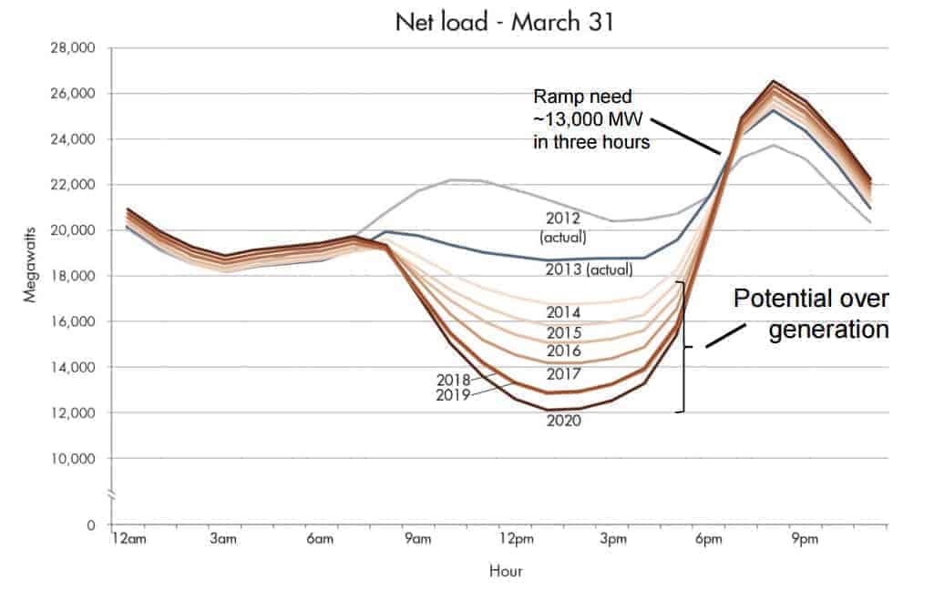
In a 2013 report, CAISO shared a chart that predicted these impacts from 2012 through 2020 that quickly became known as the “Duck Curve” because of its vague resemblance to a duck. The duck curve (shown below) is a snapshot of a 24-hour period in California on March 31.
The graph starts with the actual net load profile from March 31, 2012, and March 31, 2013, followed by predictions through 2020 as the amount of renewable energy on the grid increases. The most notable features of the chart are the mid-day drop in net load, then the increase between 3 and 7 pm. There’s a dip mid-day because that’s when the sun is strongest and we get a high volume of energy from solar, and there’s a peak into the evening because solar is no longer a source of energy and there’s an increase in energy demand.

The original Duck Curve chart. Source: CAISO
Why the Duck Curve is Important
CAISO noted that with the anticipated large-scale deployment of solar, the net load’s mid-day dip and evening peak will become sharper and pose challenges to grid management.
To reduce the increasing evening peak when energy demand is high, as the chart shows, the solution will require adding other sources of energy to the grid to replace solar, but only during the peak hours.
The Impact of the Duck Curve
Since the duck curve’s introduction in 2013, it has been used to influence decisions, such as the shift of peak time-of-use pricing in the evening to provide a pricing signal for customers to reduce their electricity consumption during those hours.
There have also been additional investments in grid-connected storage, allowing some of the mid-day solar energy to be stored and used later in the day.
How Accurate Is the Duck Curve?
CAISO’s 2013 duck curve chart used data from March 31st and predicted the net load through 2020. Now that March 2020 is in the books, we can figure out how accurate CAISO’s predictions were.
We pulled the hourly load data from CAISO’s website from late March and early April of each year, and compared it against CAISO’s predictions.
Note: CAISO did not provide the original methodology to create the duck curve, but we know March 31st fell on a weekend in 2012 and 2013, and it was clear skies for solar and fairly average temperatures across the state. Our comparison will look at days with the same clear-sky characteristics, but not necessarily the 31st of March for each year.
Predictions in the Duck Curve Are Really Close
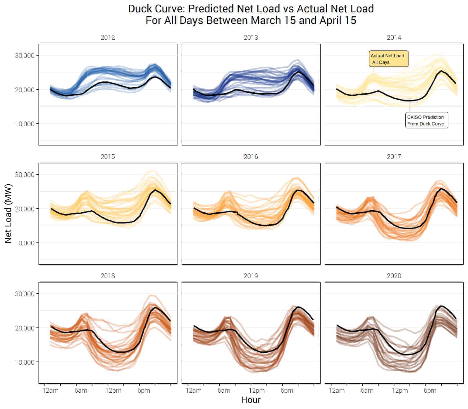
When we compare actual net load (color) against the original duck curve (black), we can see that CAISO’s 2013 predictions were very close to actual net load profiles all the way through 2020.
The mid-day minimum of net load has fallen lower and lower as California installed solar on over a million rooftops and added over 27 GW of solar energy to the grid. There is a notable morning mini-peak that appears around 7 am starting in 2016, but this is a result of using weekday instead of weekend dates to match the same clear-sky characteristics from 2013 and 2014.

But If You Dig in Deeper…
Expanding the data and taking a closer look, we do see some changing patterns in the net load profiles. When we plot the actual net load (color) for each day between March 15 and April 15 and compare it against CAISO’s predictions (black), the actual load starts to dip lower than CAISO’s predictions starting in 2017.
This means that CAISO’s analysis in 2013 underpredicted the magnitude of the mid-day dip that we are seeing on the grid. Additionally, the duck curve has morphed to include a morning tail bump as well, further complicating CAISO’s grid operations strategy.

Final Thoughts on the Duck Curve
CAISO’s duck curve proved to be fairly accurate, and although the rate of solar installations slightly outpaced the predictions, the operator has been able to keep California’s grid stable even through challenging times like COVID-19. As California continues to lead the country in installing renewables, we will keep a careful eye on how the duck curve continues to evolve.
The original graph was traced to extract the data, so small errors may be present.
Data source: https://www.caiso.com/market/Pages/ReportsBulletins/RenewablesReporting.aspx
